Navigating Degree Requirements

This project was a much needed overhaul of an overly complex and overwhelming component on the degree plan page. I set out to design something that met the product owner’s objectives while simplifying the interface and experience for our users.

To add new functionality, I worked directly with developers to quickly understand the data we were working with and identified the scenarios we needed to support. Iterating on a number of designs while conducting usability testing is how I landed at a solution that greatly improved the experience.

Goal

The goal for this projects was to make it easier to understand what’s left to plan and motivate the user to finish planning their degree while supporting optional degree requirements.

Context

DEGREE PLAN PAGE

The degree plan page had three main components. For this project we were mainly looking at the Degree Requirements piece.

  1. Degree Progress
    This space showed a student’s current progress towards their declared degree.
  2. Degree Requirements
    In this location, students would find courses and placeholders to add to their timeline.
  3. Timeline
    This is where courses were added to terms in academic years.
Thumbnail showing the layout of the degree plan page.

Things to Consider

Optional Requirements

We needed to support optional requirements during the planning process. This was new functionality for the product and the design at the time couldn’t support it.

An optional requirement is sometimes referred to as a track. For example, to satisfy a foreign language requirement a student must choose the French, Spanish, or German track.

When working with engineering we identified eight different types of optional requirements the design needed to handle.

For requirement lines A, B, C, D, E and F:

  1. A or B or C or D
  2. A and B and C and D
  3. (A and B) or (C)
  4. (A and B) or (C and D)
  5. (A and B) or (C = for student group P)
  6. 2 of 3: (A and B) or (C and D) or (E and F)
  7. (A or B) and (C or D)
  8. At least 1 of A or B or C or D
Screenshot of the eight different types of optional requirements laid out next to each other.
Some early notes to understand how the different options might be displayed.

What’s Left to Plan?

Some of our users gave us feedback that they wished they could choose to only see what they had left to plan since we showed everything regardless of completion status.

We had a number of filters, but not one that would show remaining courses. The initial request from product was that we add a new filter, but I believed there was a way to do this without the use of filters and in a way that would allow us to remove filters from the component altogether.

Motivate Planning

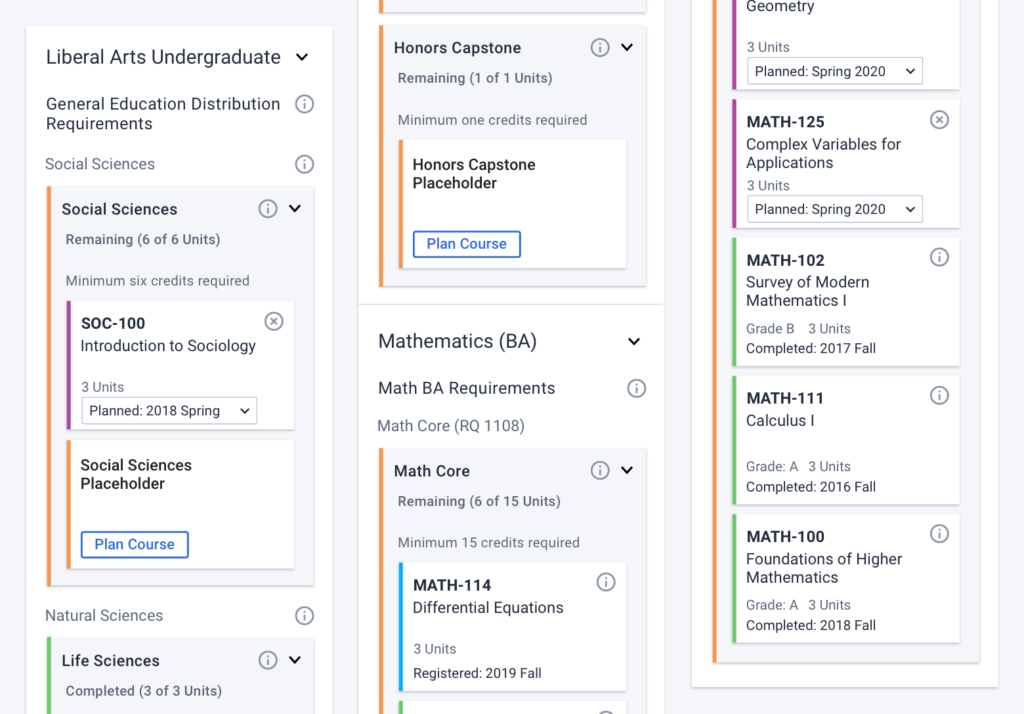
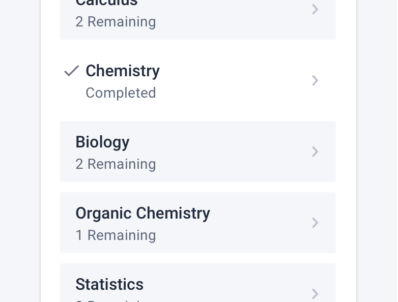
We wanted to help motivate students to plan their degree. Part of this was simplifying the display of progress so that there was clarity around what the user had accomplished and what they still had to do. Another part was using design as a way to motivate planning.

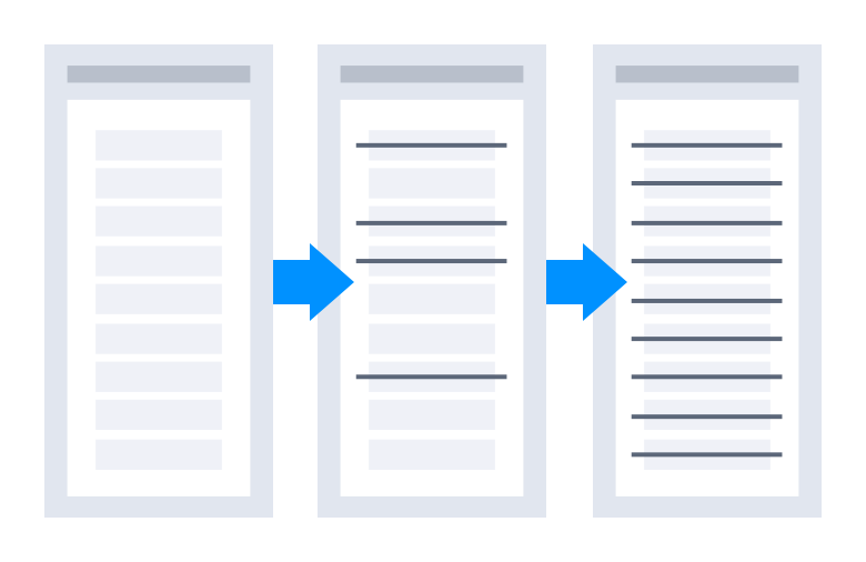
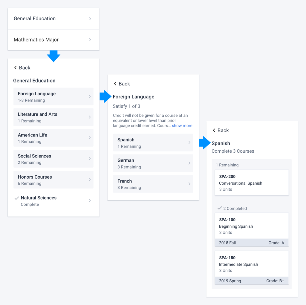
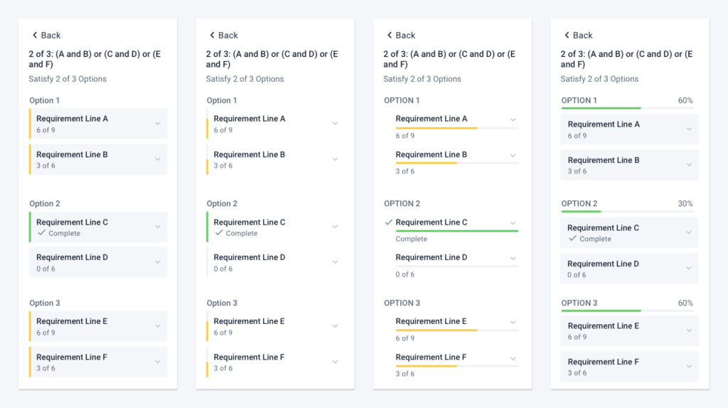
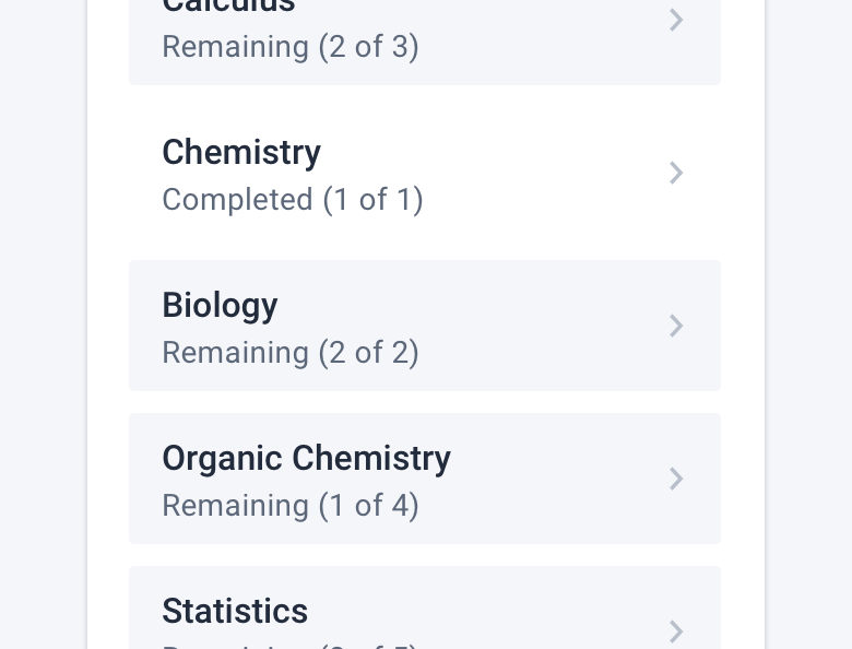
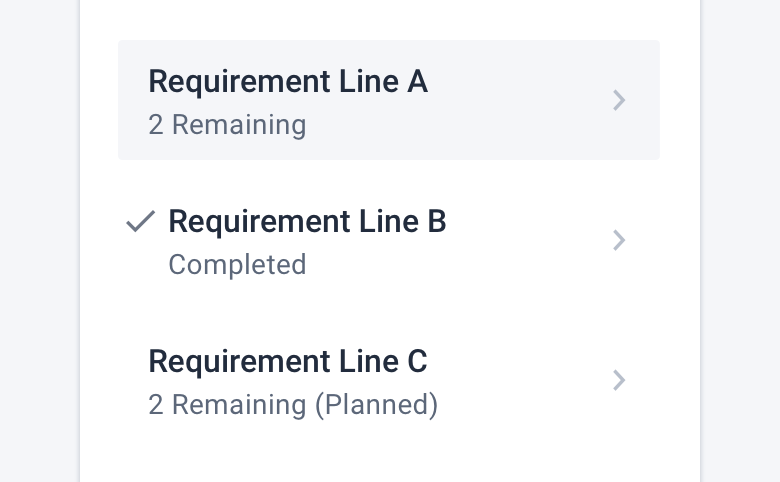
One concept was to let the list of requirements decrease as users moved courses from the component over to their timeline. This would give a sense of accomplishment as planning was taking place and the component would be successfully empty once the degree was planned.

I liked this idea most, but because the component was also being used as a way to see progress towards requirements, we couldn’t move forward in this direction.

Thumbnail showing the flow of a shrinking list from start to finish.

The second concept was to have the component act similar to a to do list. As courses were planned, requirements on the list would be crossed off or checked in some way to let the users clearly see what was done and focus on the remaining things to plan. I ended up using a checkmark to help users identify completed items.

Thumbnail showing the flow of a to do list from start to finish.

Designs & Iterations

Navigation

I changed the overall behavior of navigating degree requirements from an expand/collapse interaction to drilling in and out. The purpose was to keep the user focused on what they’d chosen to look at. This became especially important when optionality was thrown into the mix. I wanted to make sure the user was only looking at a single option at a time.

This change eliminated the repeated headings and greatly reduced the amount of scrolling necessary to navigate the requirements. It also created enough space to remove the “i” icons and display that information directly under the heading it belonged to.

The degree requirement component before redesign showing how overwhelming it was.
Users frequently got lost and overwhelmed by the amount of scrolling and information they were looking at.
Users successfully navigated in and out of requirements and found the information they were looking for during usability testing.

Use of Color

I wanted to challenge the use of color in this space. The colors were used as a way to categorize courses and requirements (planned, completed, registered, and remaining), but we found that users weren’t really sure what the colors meant. We also found that users were overwhelmed by the amount of colors on the page. I wanted to be more intentional with the use of color.

I started by reducing the number of colors to two. Yellow for “in progress” and green for “complete.” I tried a number of designs using two colors to show progress in different ways.

A few of the iterations for showing progress using one or two colors within the component.

After additional testing, I reduced the number of colors down to one and eventually removed the color completely. It turned out that less is more in this case. The fewer distractions, the less confusion.

Confusing Calculations

Something that immediately confused users during testing was the way we displayed progress. Guided by the “What’s left to plan?” question, I simplified the display to show only the number of remaining courses. Also, displaying the number before the label made it much easier to scan.

The degree requirement component with a more detailed display of progress.
When seeing “Completed (3 of 3)” and “Remaining (2 of 3)” people started doing math and getting really confused.
The degree requirement component with a simple display of progress.
By only showing what’s remaining, users stopped trying to do math and sailed through the planning process during testing.

Pay Attention to Planning

I wanted to keep the users’ attention on items they hadn’t completed or planned. To do this I created three stages for each requirement.

  1. When incomplete, a requirement was in a gray box with an “X Remaining” label.
  2. When complete, it got a checkmark with a “Completed” label, and fell into the white background.
  3. When planned, it fell to the background just like a completed requirement, but the label read “X Remaining (Planned)” so that the user would know the requirement was incomplete but planned.
The three stages of what a requirement can look like based on whether it's remaining, planned, or complete.

By having the completed and planned items fall to the background, we keep the users attention on the unplanned items. This worked really well. In testing, users had no desire to go into completed requirements, they just wanted to plan what was left.

Wrapping Up the Design

Degree Progress

The last step was moving the degree progress wheel and bars closer to the requirements. This brought the timeline and planning area up to the top of the page and helped associate progress with the degree requirements component.

New layout of the degree plan page moving the progress closer to the degree requirement component
Moving the progress wheel and bars closer to the degree requirements gives better context to both and allows the planning area to move to the top of the page.

After testing the final iteration of the design, we hit the main goals we set out to achieve. We added optionality and users were able to easily navigate requirements to find the information they needed to make decisions and plan their degree.

Future Considerations

Course Cards

I would look at the course and placeholder card design and functionality in both the requirement component and the degree plan timeline.

Breadcrumbs

If the number of levels ever exceeded four I would consider adding breadcrumbs to help users navigate a larger degree requirements tree.